Indirect research
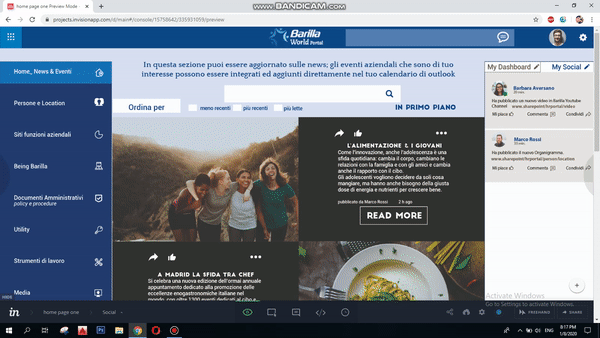
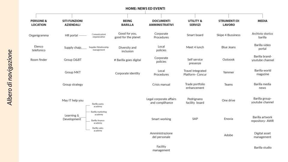
The first phase of the analysis process is desk research. In particular, the mapping of the Barilla Word Portal. The aim is to identify all the elements that characterize it, the challenges and areas to be explored.
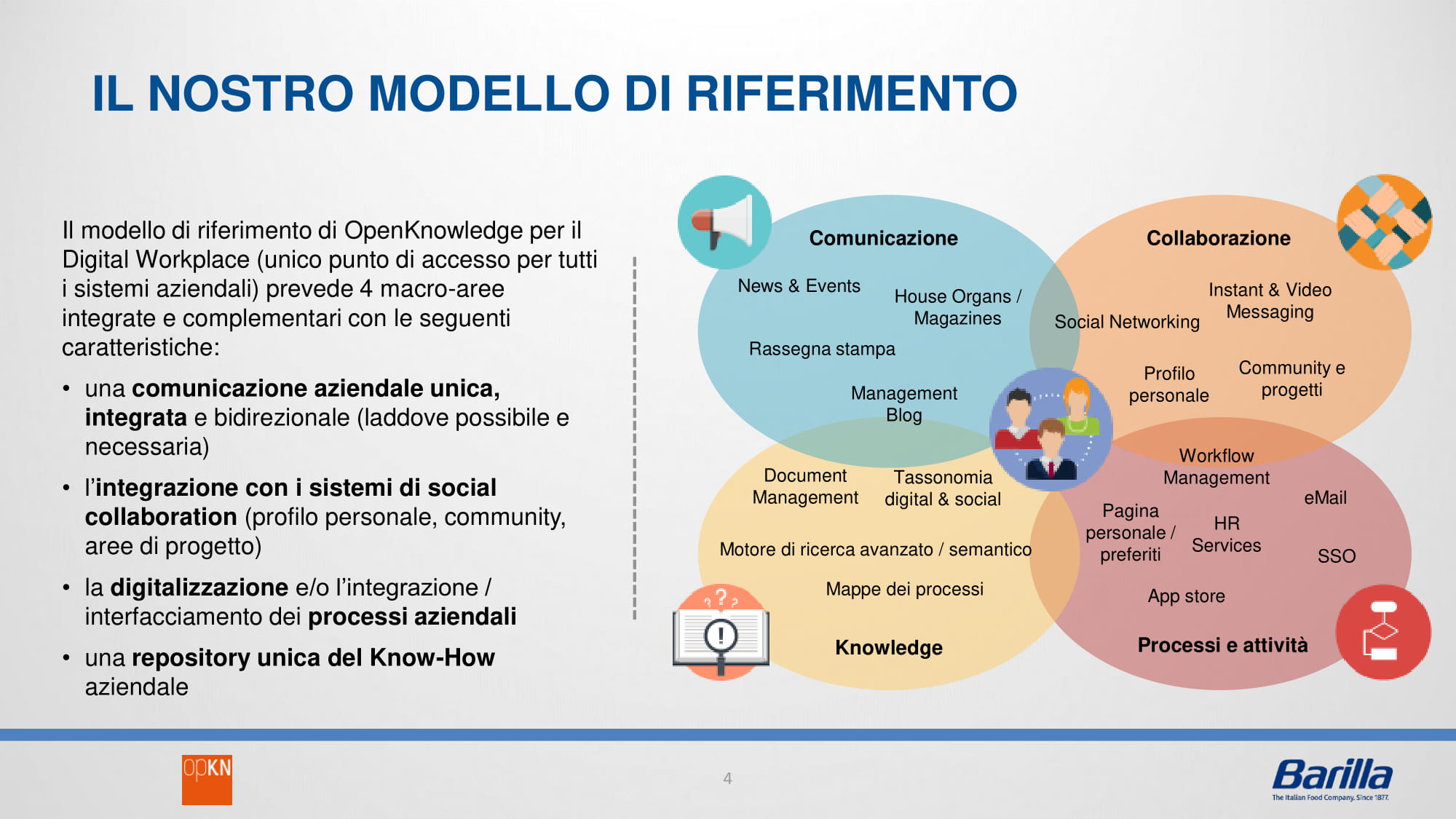
Digital Workplace: a new digital workspace that offers people tailor-made access to communication, content and services.
To enable a more agile way of working, we want to develop a digital ecosystem of fully integrated online apps, tools and services, adapted to the needs of professional roles, where people are able to find what they need and share quickly and easily. what they know with consistent experiences on devices and places.
The first phase of the analysis process is desk research. In particular, the mapping of the Barilla Word Portal. The aim is to identify all the elements that characterize it, the challenges and areas to be explored.
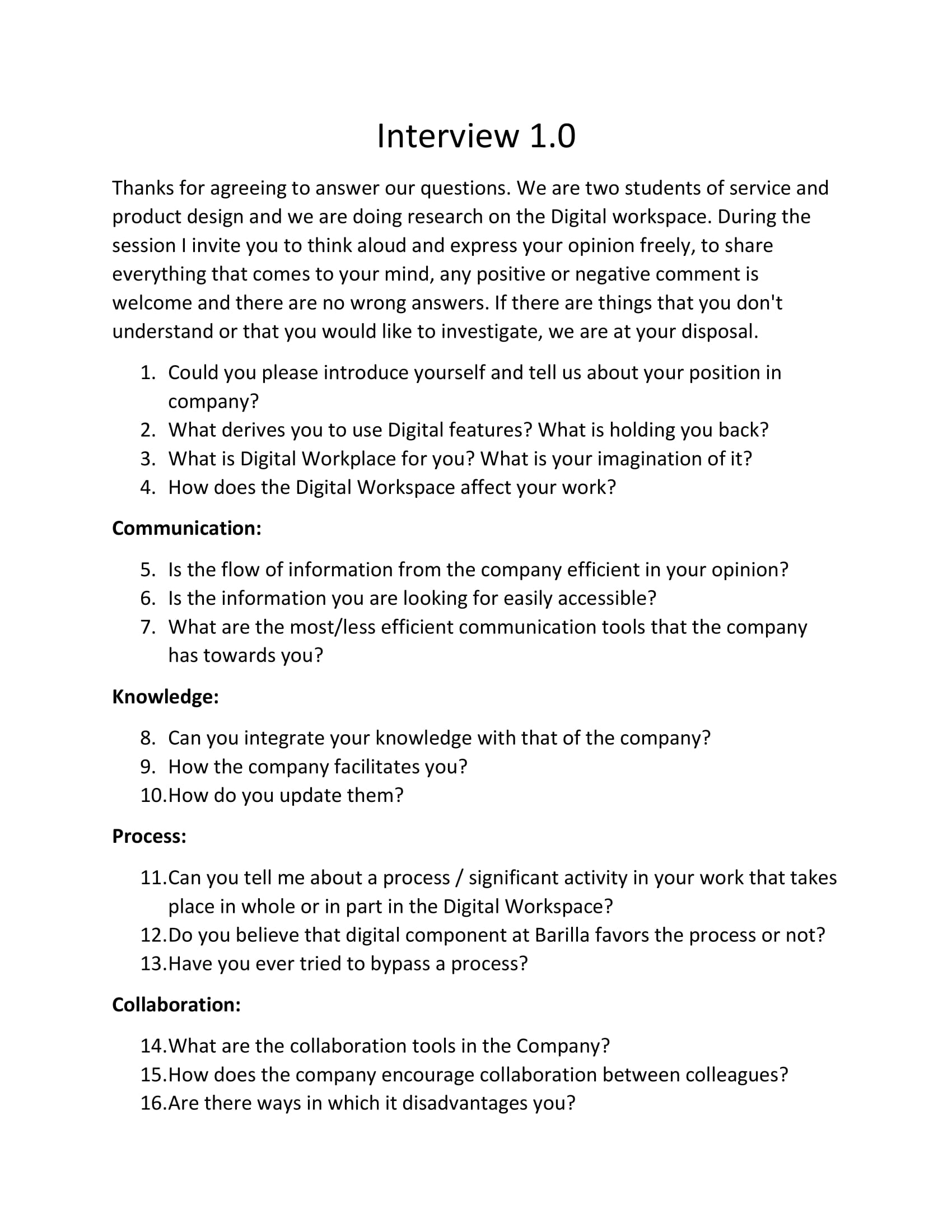
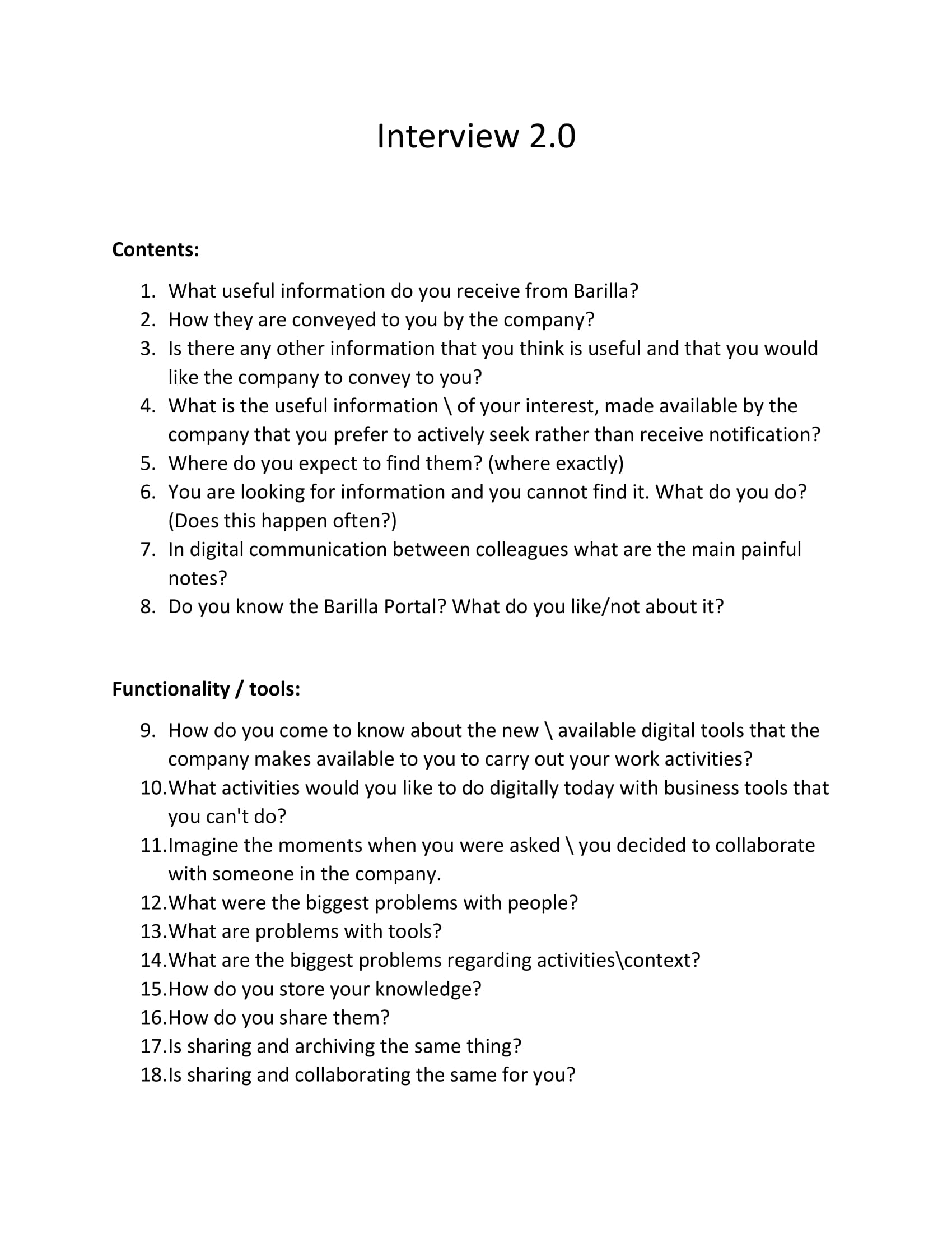
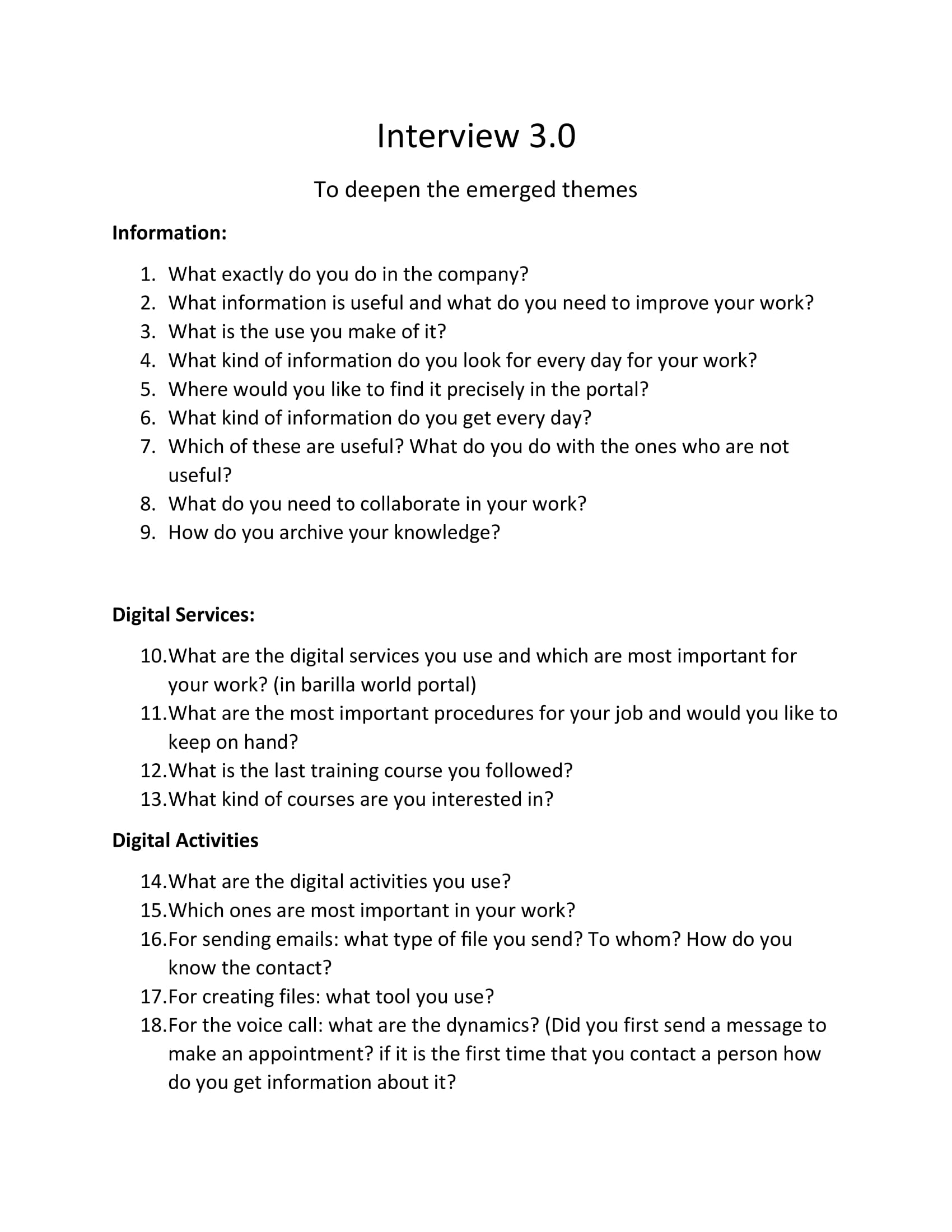
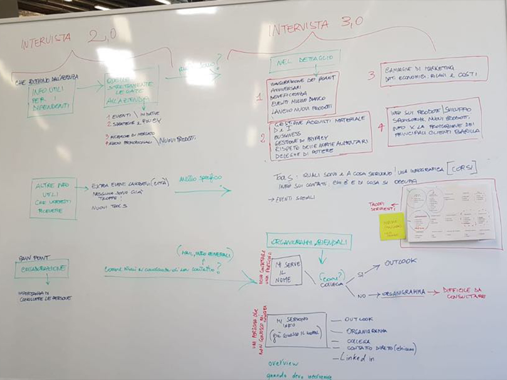
The research phase began with the writing of an interview born from the evidence that emerged during the indirect research phase. The goal is to explore in greater depth the knowledge of the Digital Workplace by Barilla employees and their daily personal interaction with that space and in particular with the Barilla Word Portal.
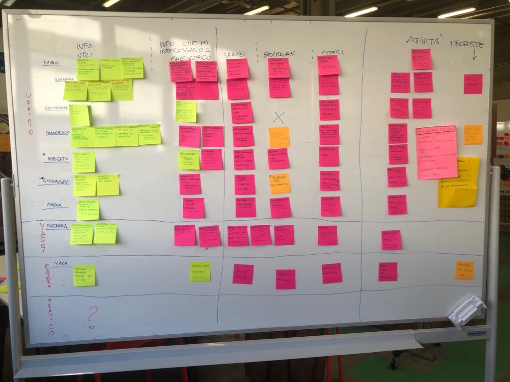
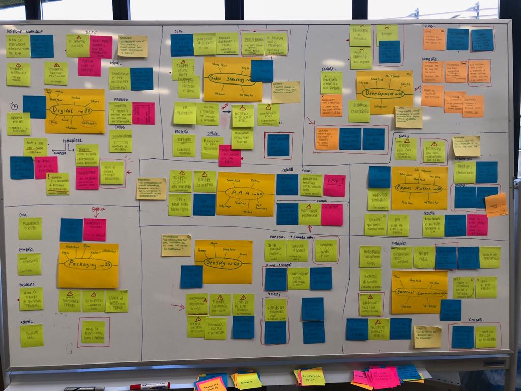
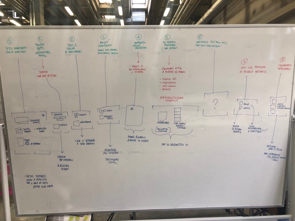
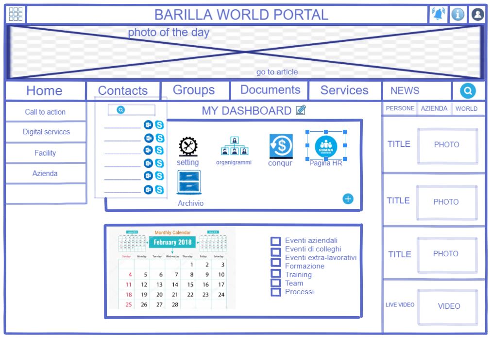
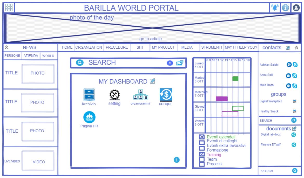
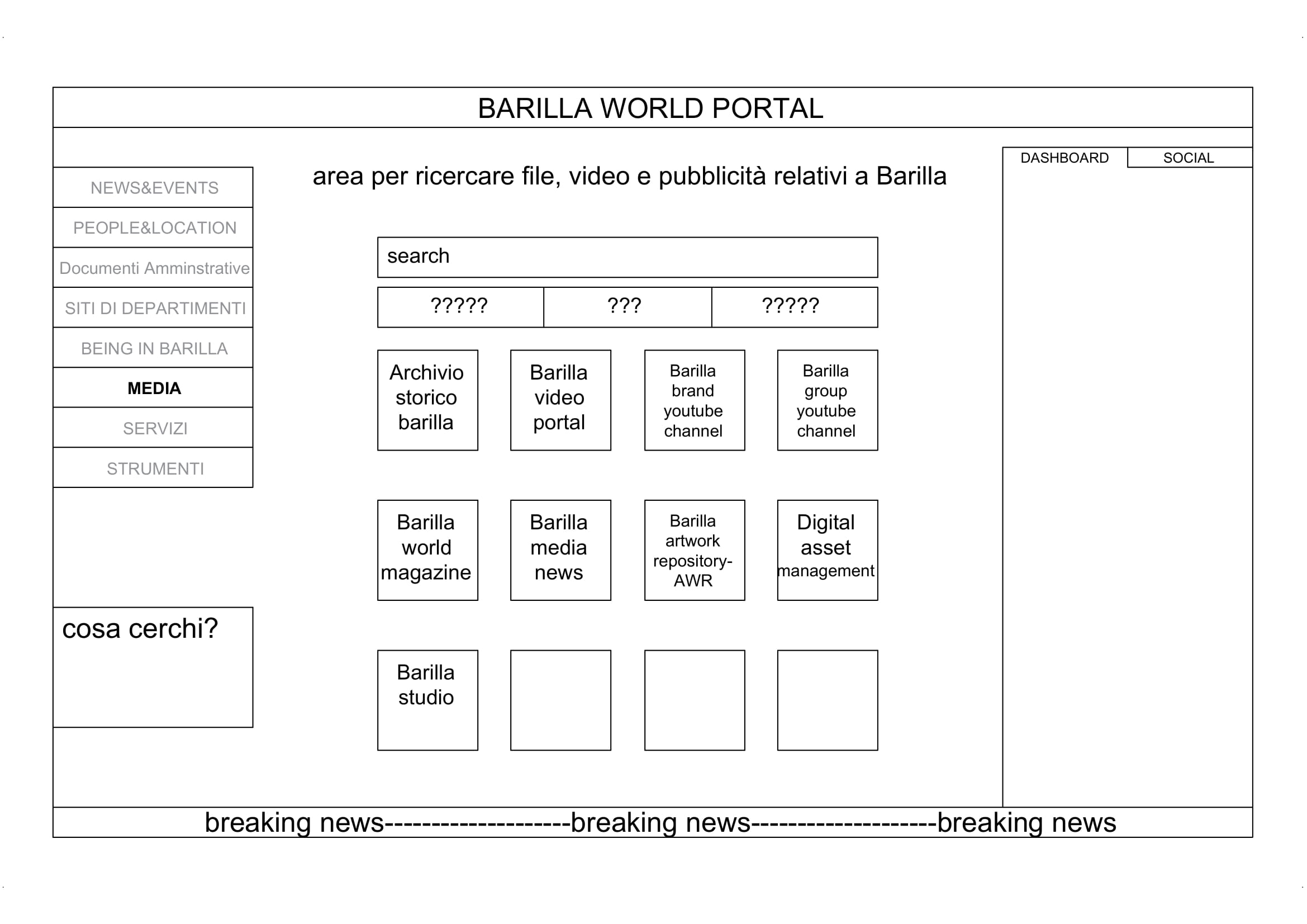
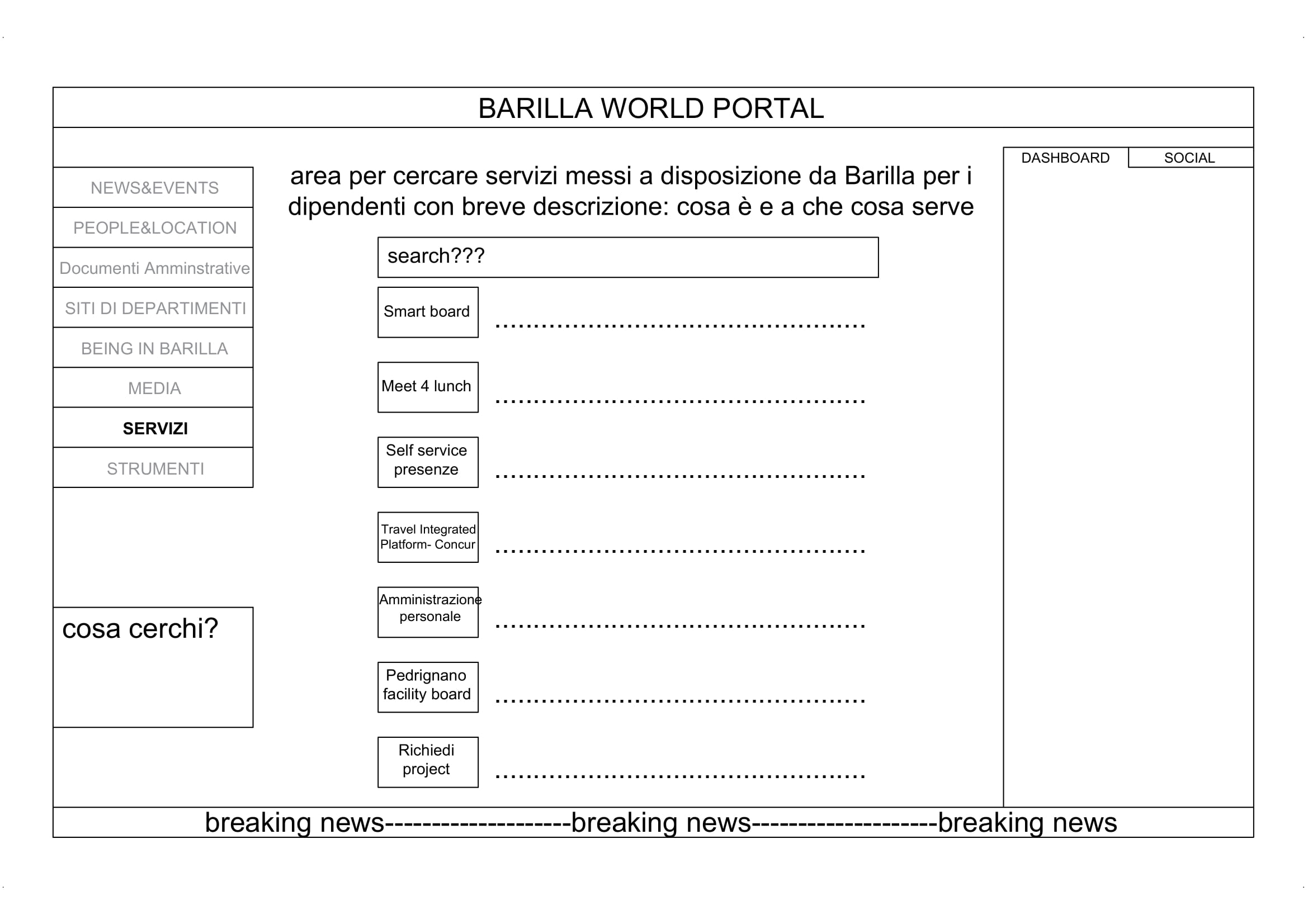
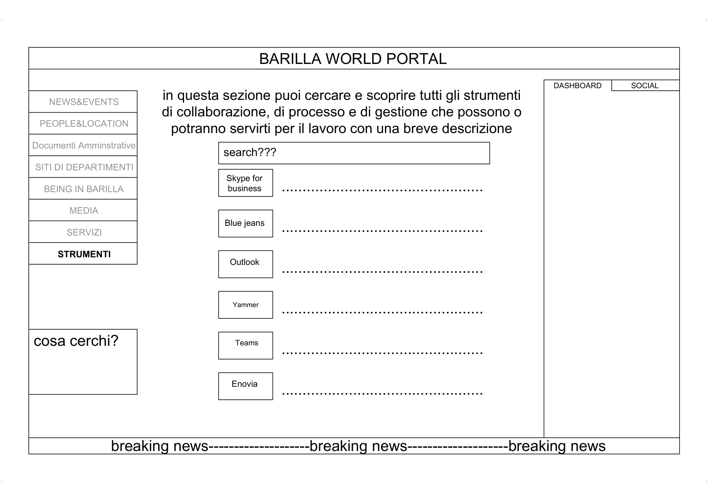
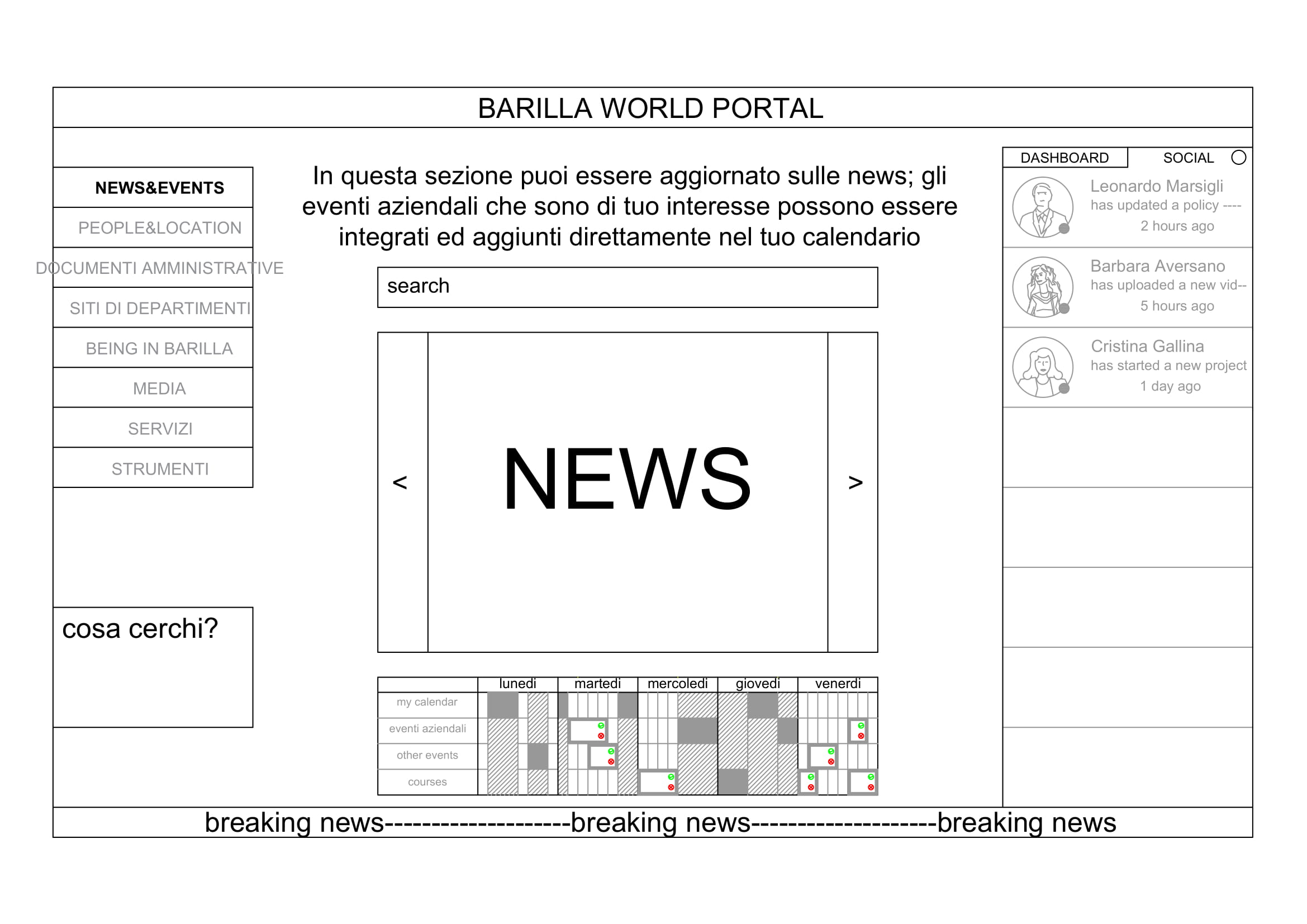
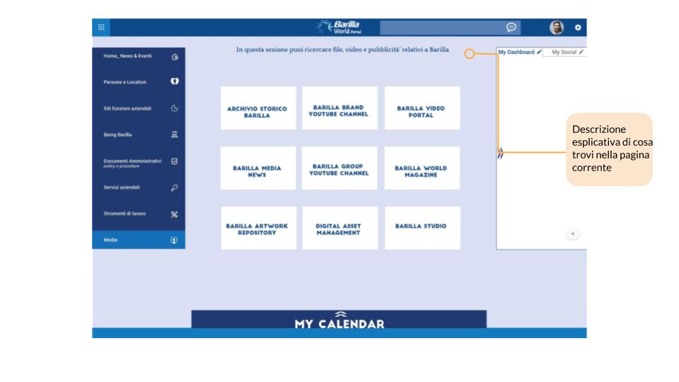
The focus group was created with the aim of prioritizing the services and information currently present in the Barilla Word Portal and gathering ideas to organize the portal homepage more efficiently.
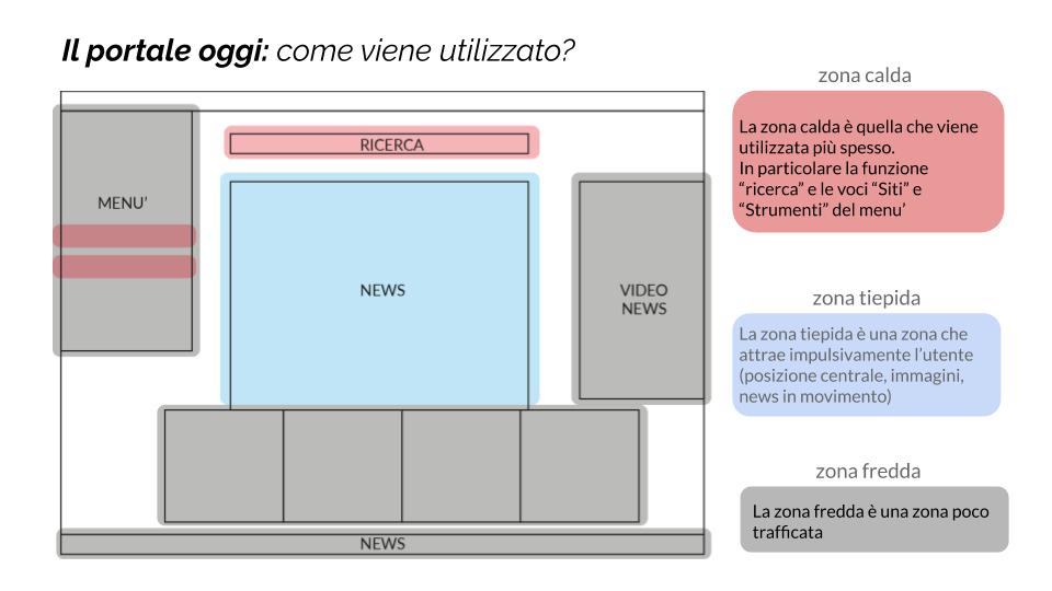
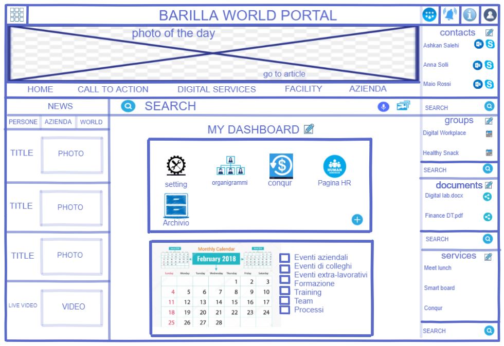
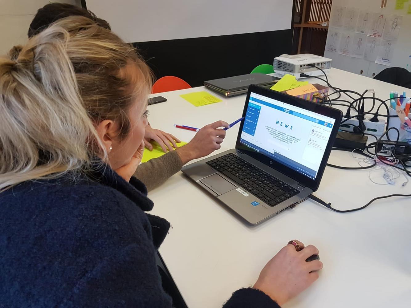
The portal is not perceived as alive.
People's perception is that the information is not updated and organized intuitively.
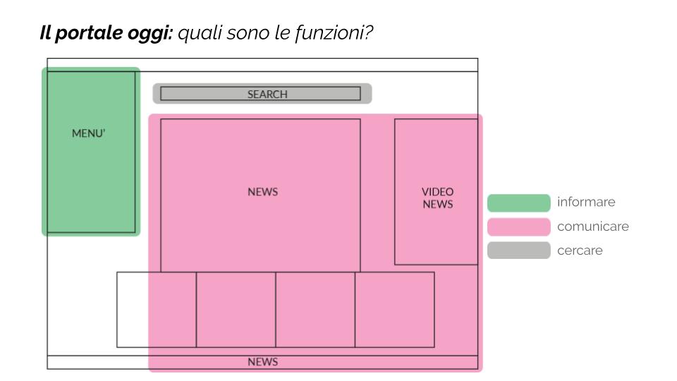
There are too many tools and it is not clear what their operation is and what their goal is; tools that are not allowed are used despite safety concerns.
The menu is complex: it is not easy to use.
The relationship with the news is mainly impulsive; there are different types of news in different sections of the page and this is not intuitive for the user.
Access to the tools and information used daily is complex: The possibility of customization is seen as an added value for the portal.
Information about people is not enough and the organization chart it is not navigable.
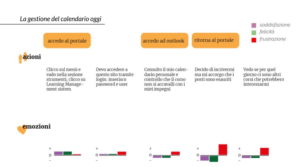
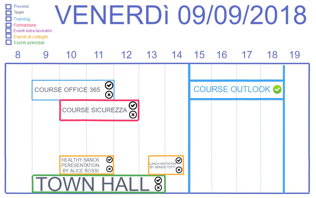
The integration between personal calendar and corporate events and courses is missing.
After understanding what the needs of the individual and therefore of the users who use the portal on a daily basis, we moved on to wanting to understand what the needs of those who publish the contents are.
What was emerged?
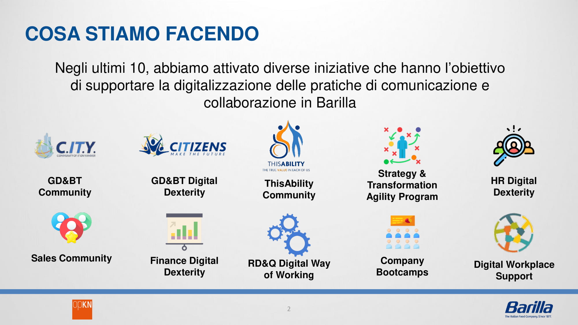
The case studies were shared with us by "Open Knowledge Company". They had already activated several initiatives that aim to support the digitalization of communication and collaboration practices in Barilla.
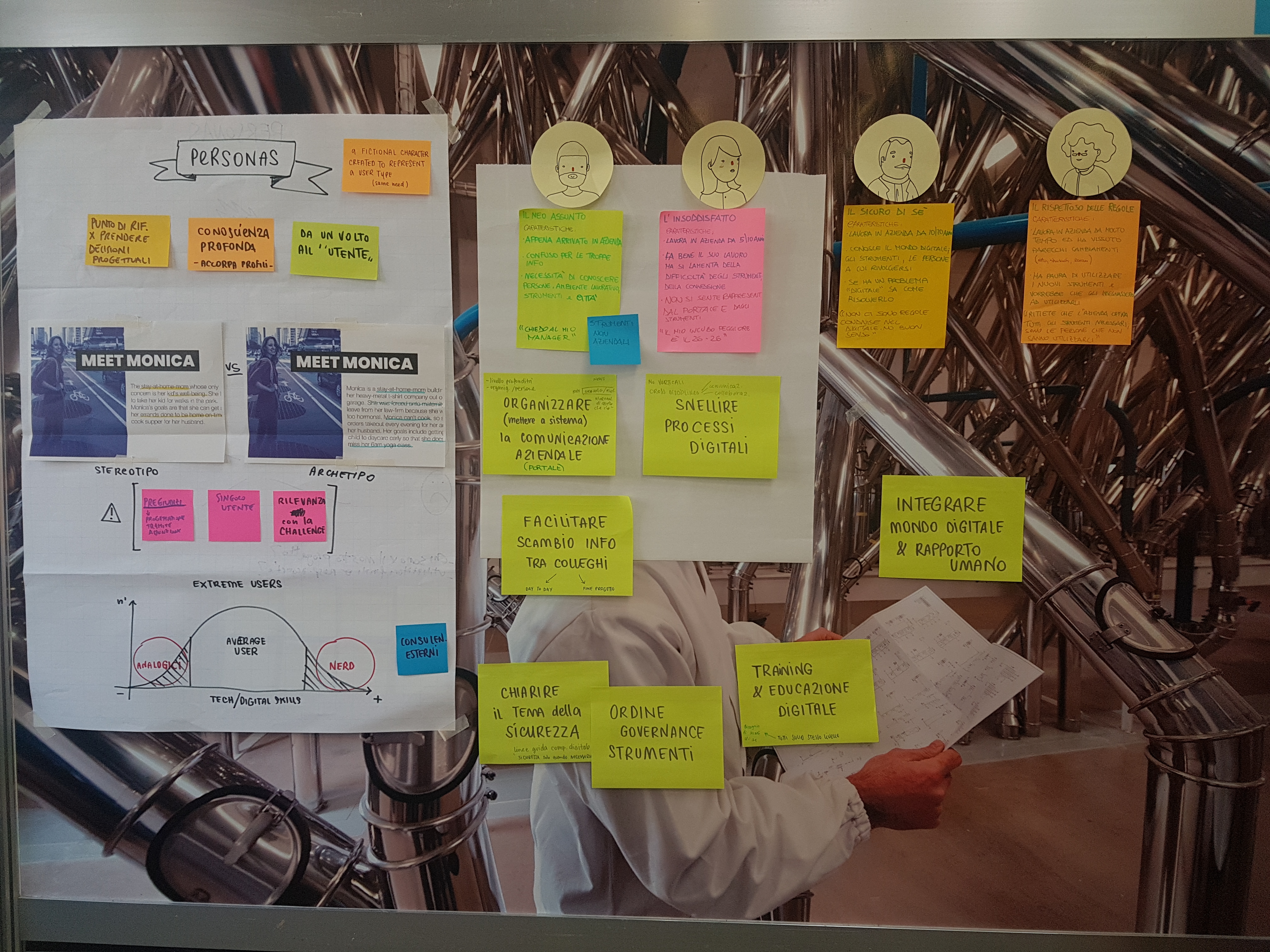
We defined 4 different personas for our project according to their age of employyes, their experience working at Barilla, the department they are working in, the possible needs and requirements they may have, the problems they may face, and how frequently they have to travel.
We made different scenarios to identify all main touchpoints and all channels associated with each touchpoint.
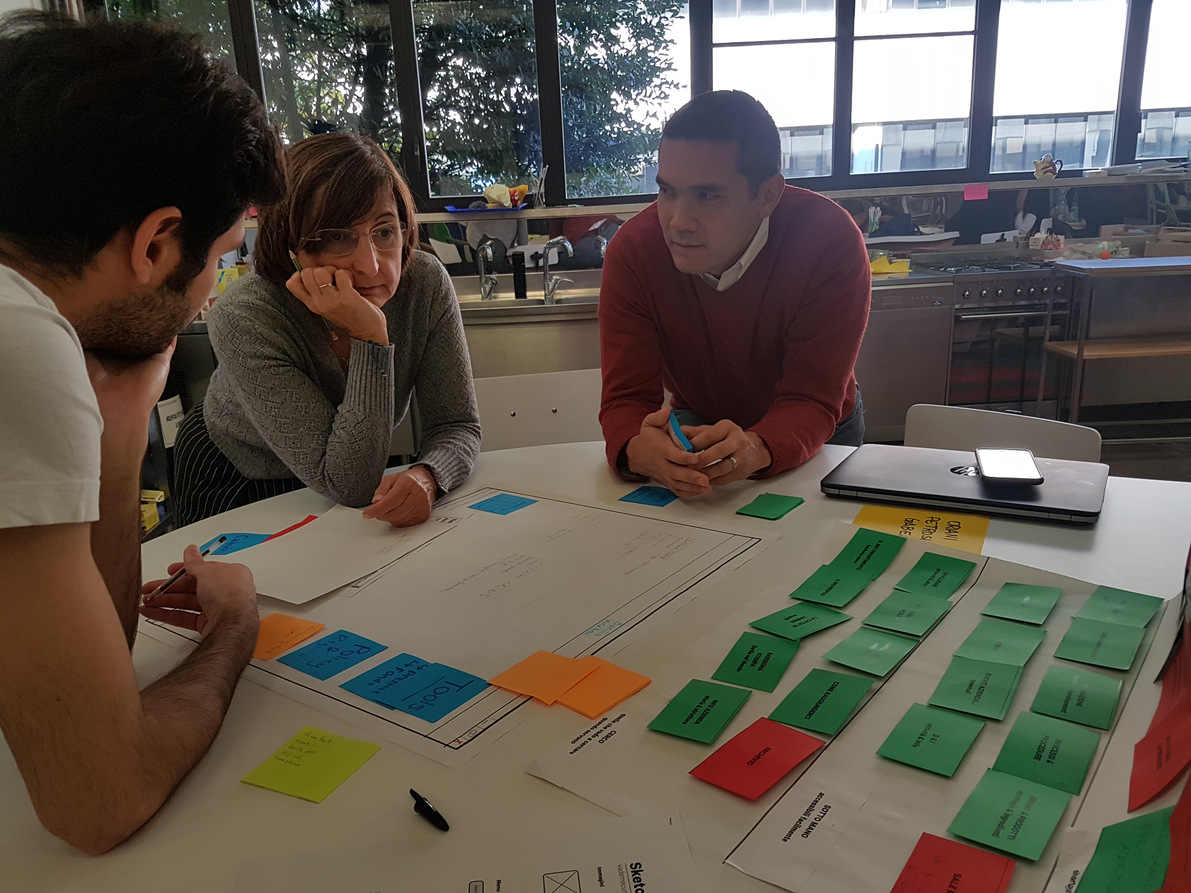
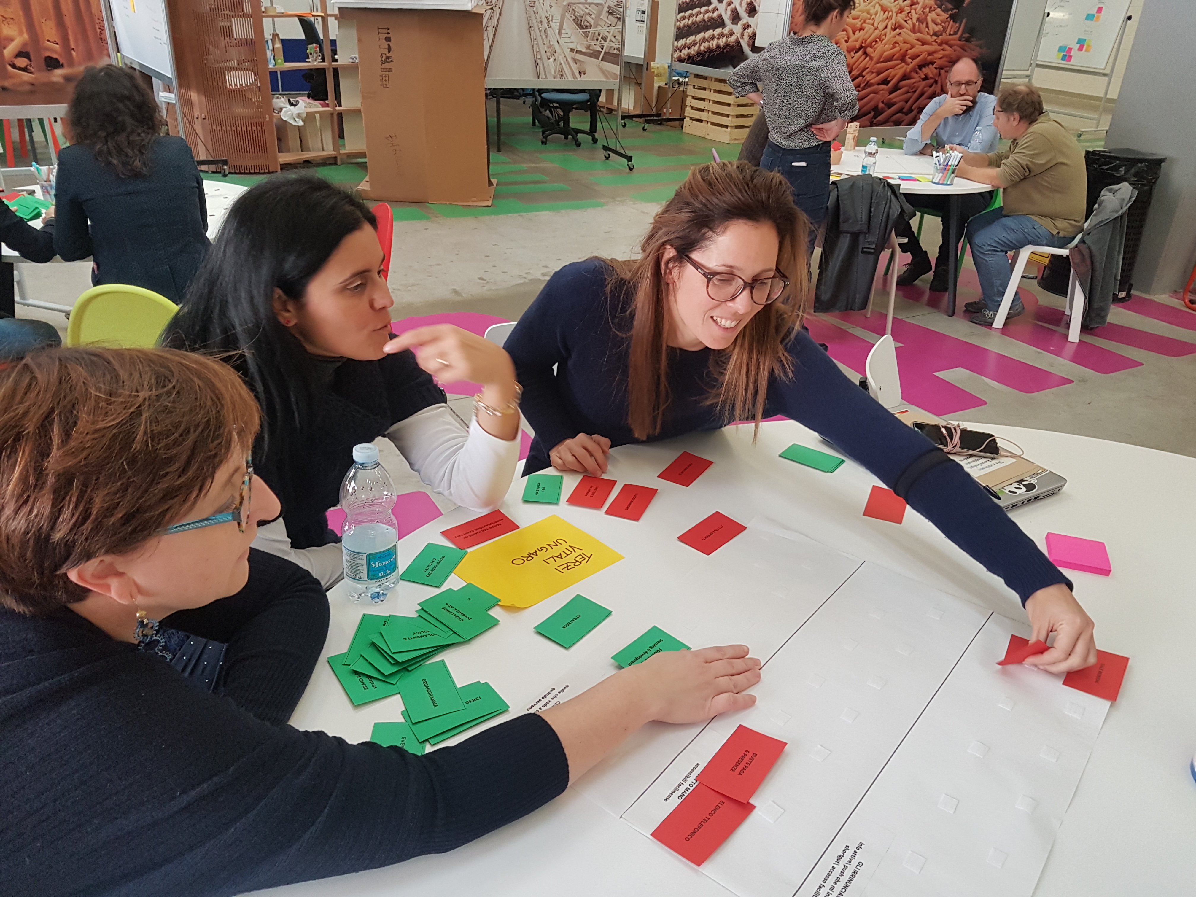
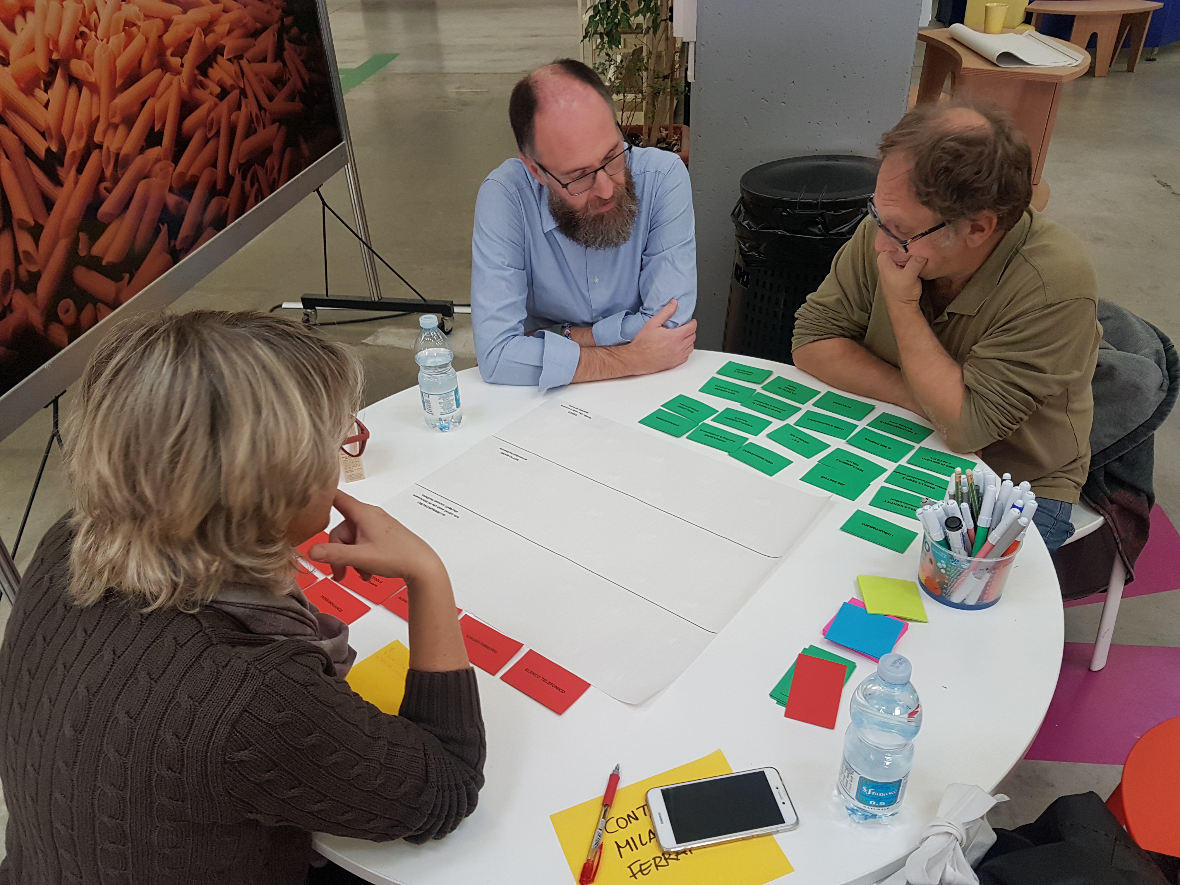
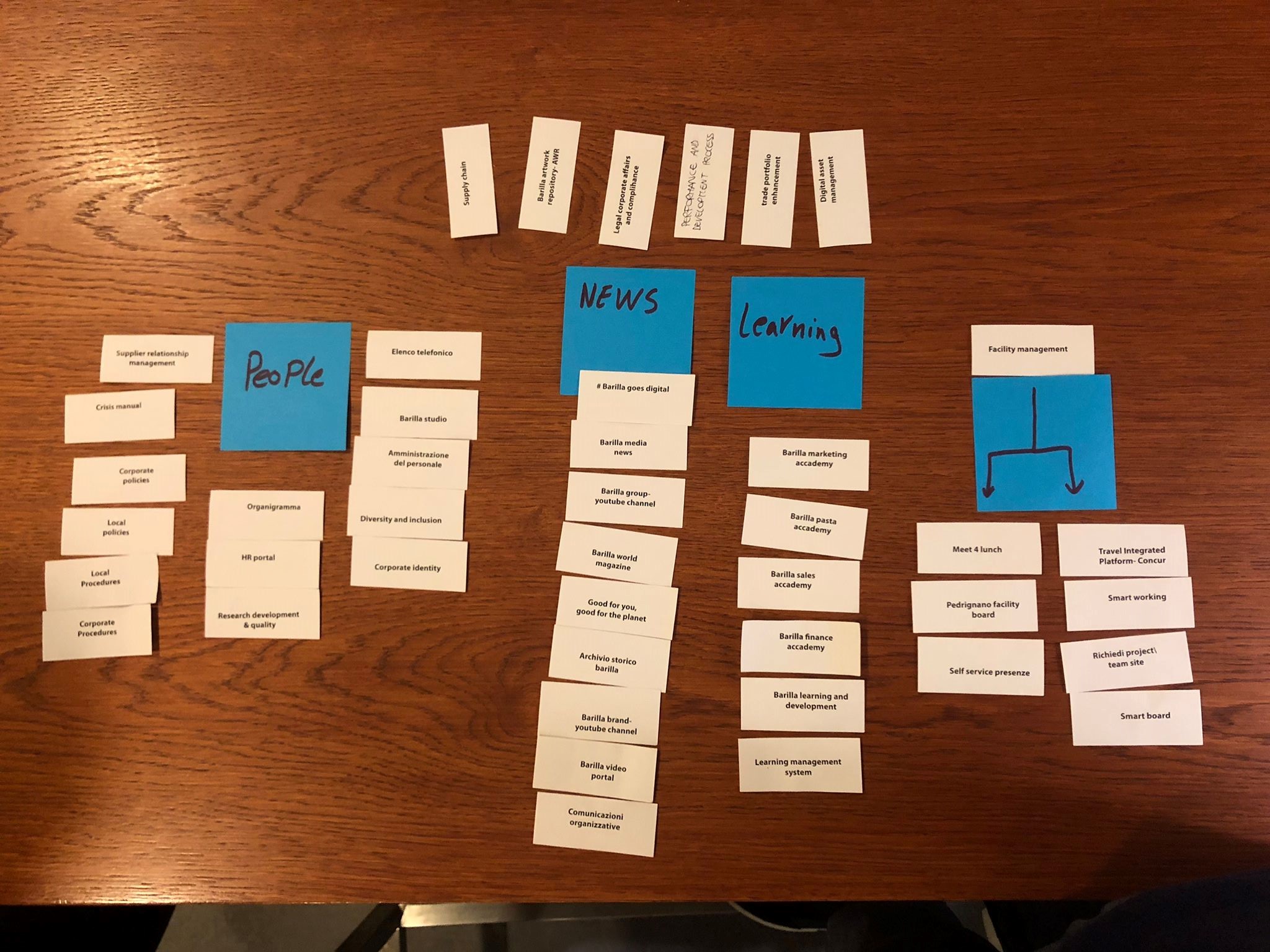
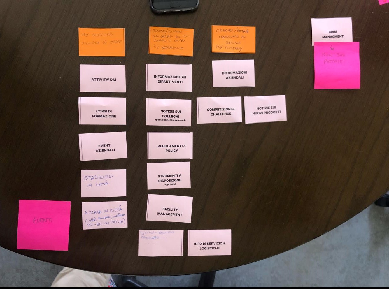
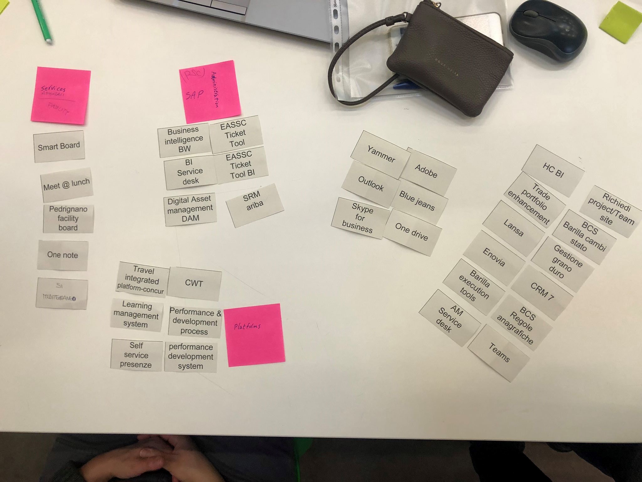
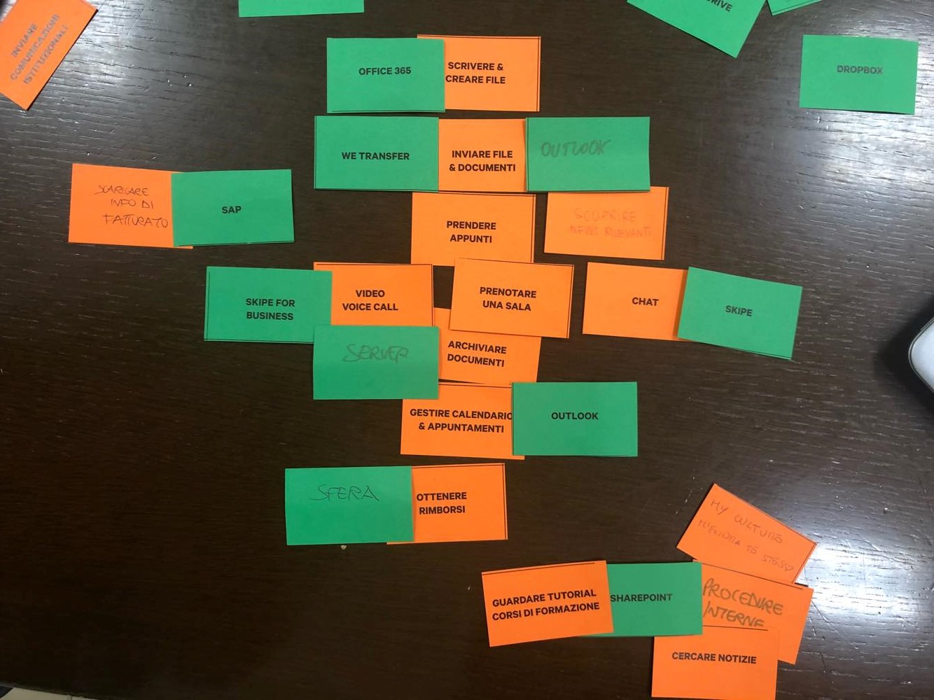
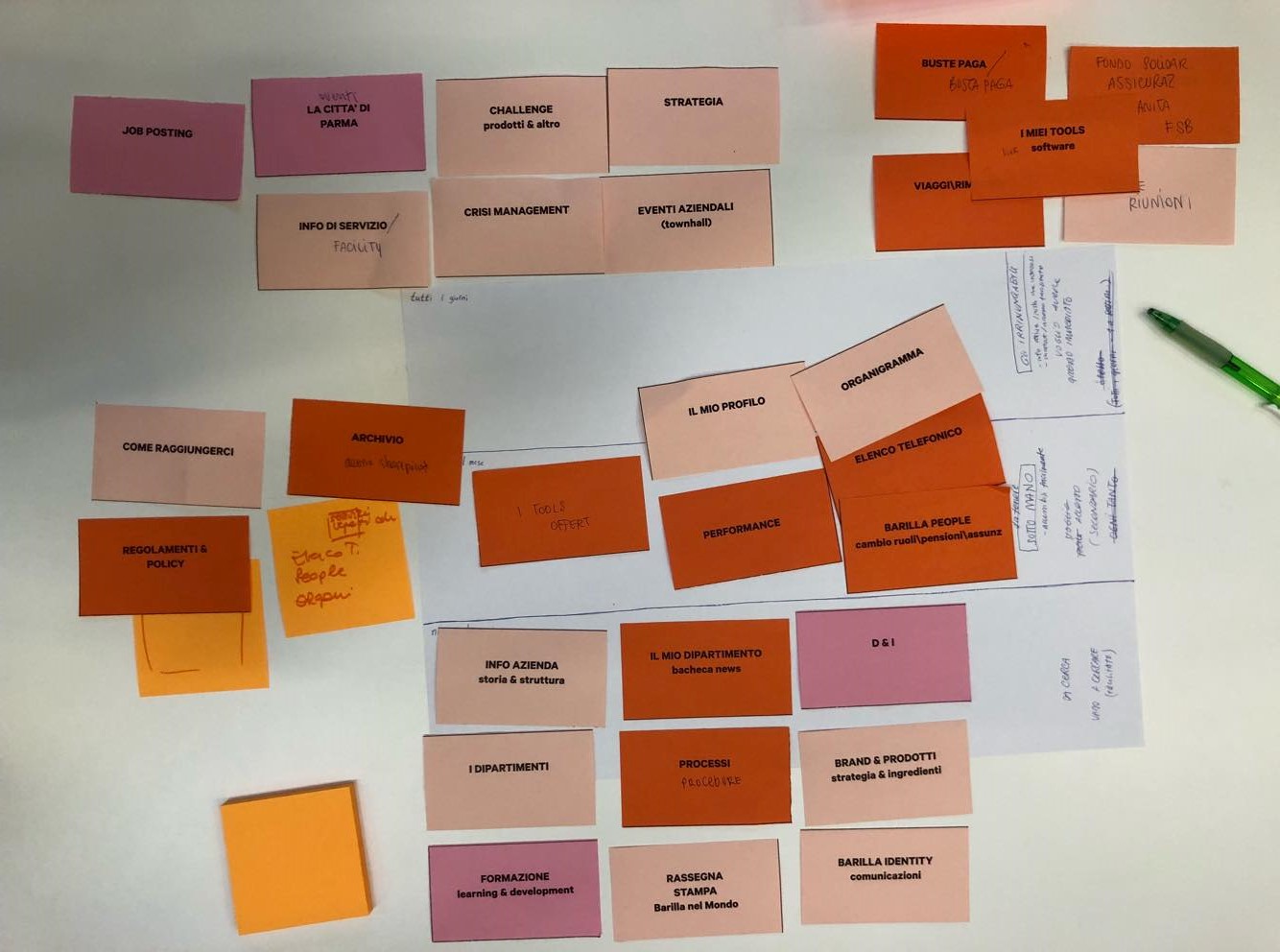
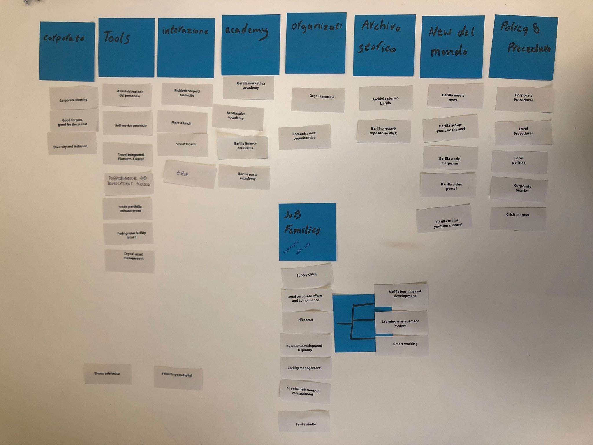
The card sorting method was used to help us design or evaluate the information architecture of a site. In a card sorting session, participants organize topics into categories that make sense to them and they may also help you label these groups.
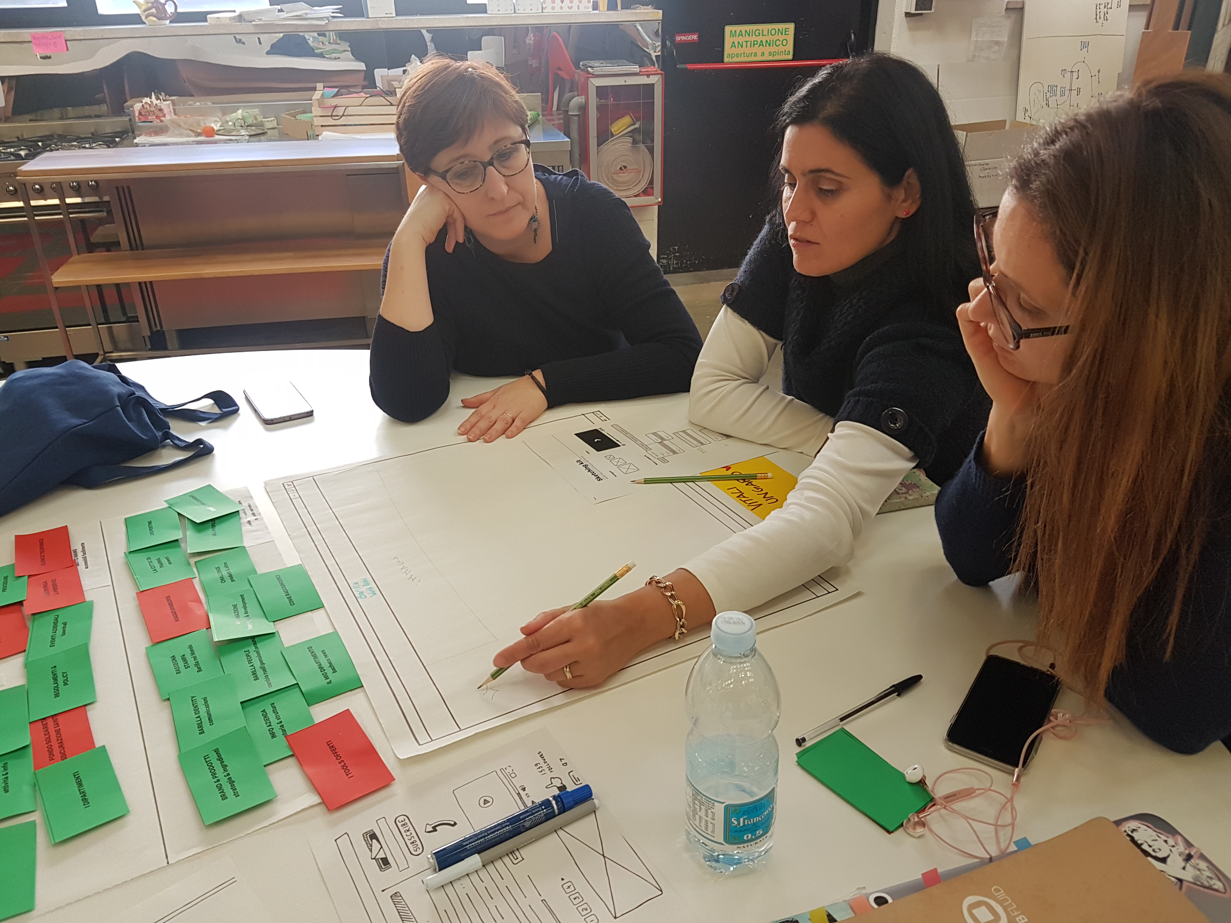
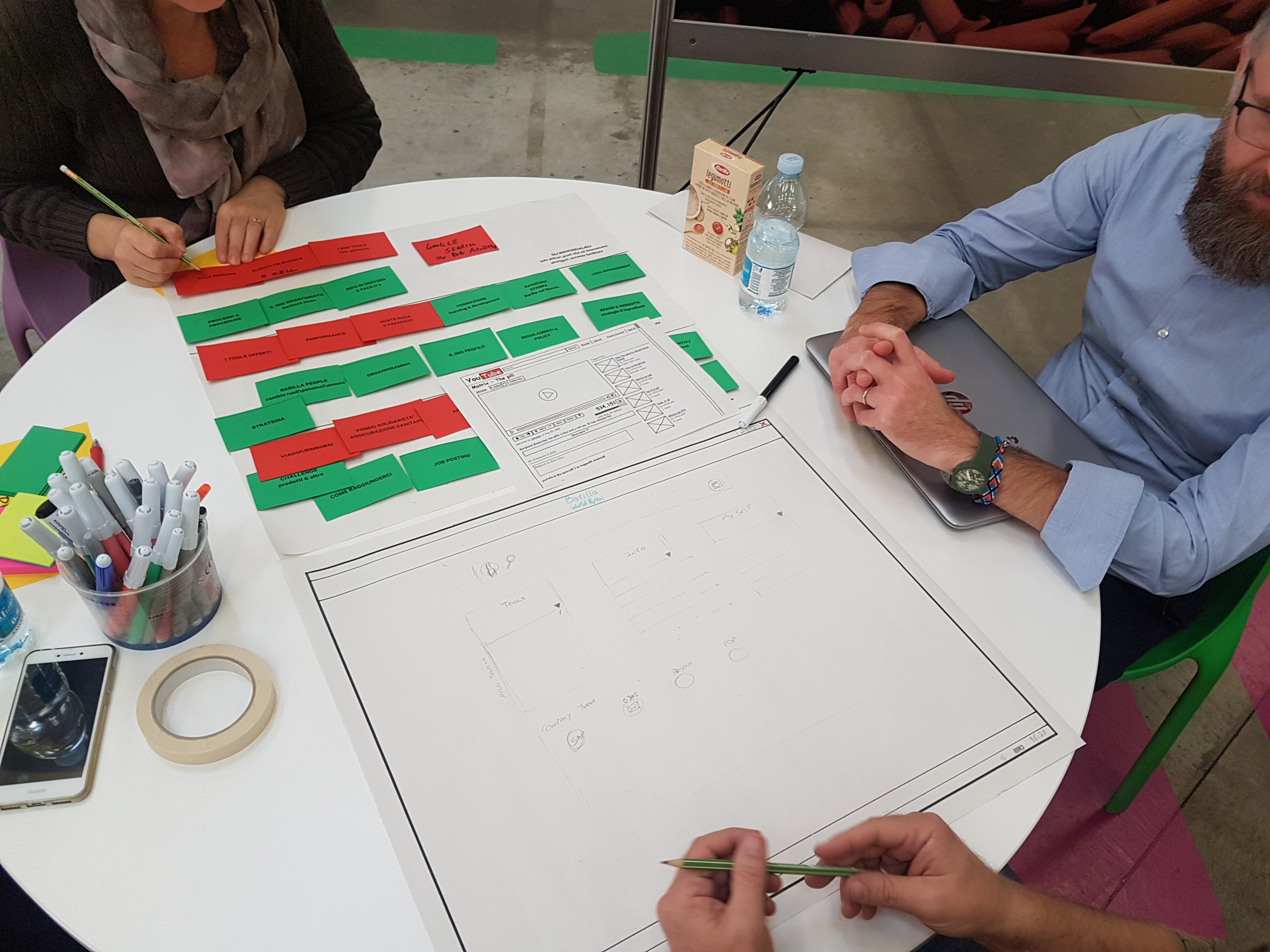
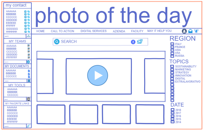
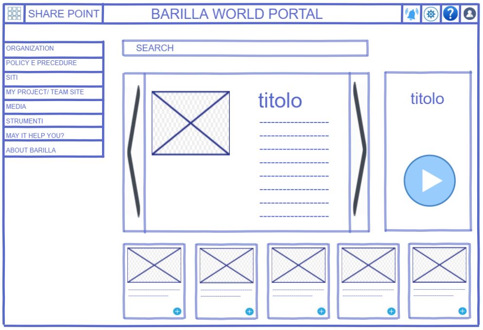
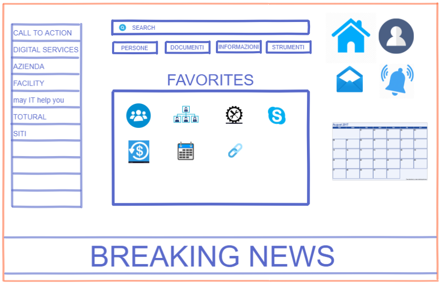
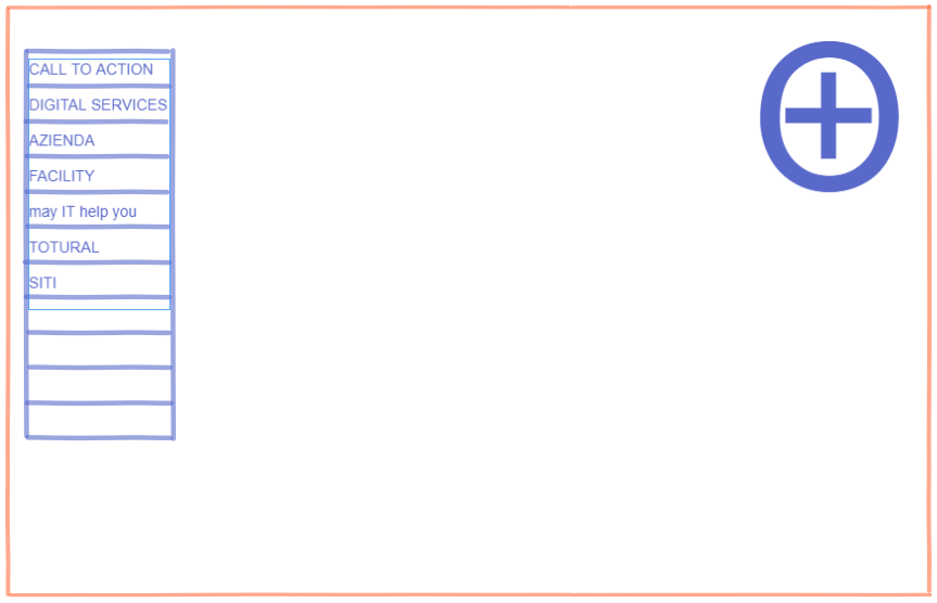
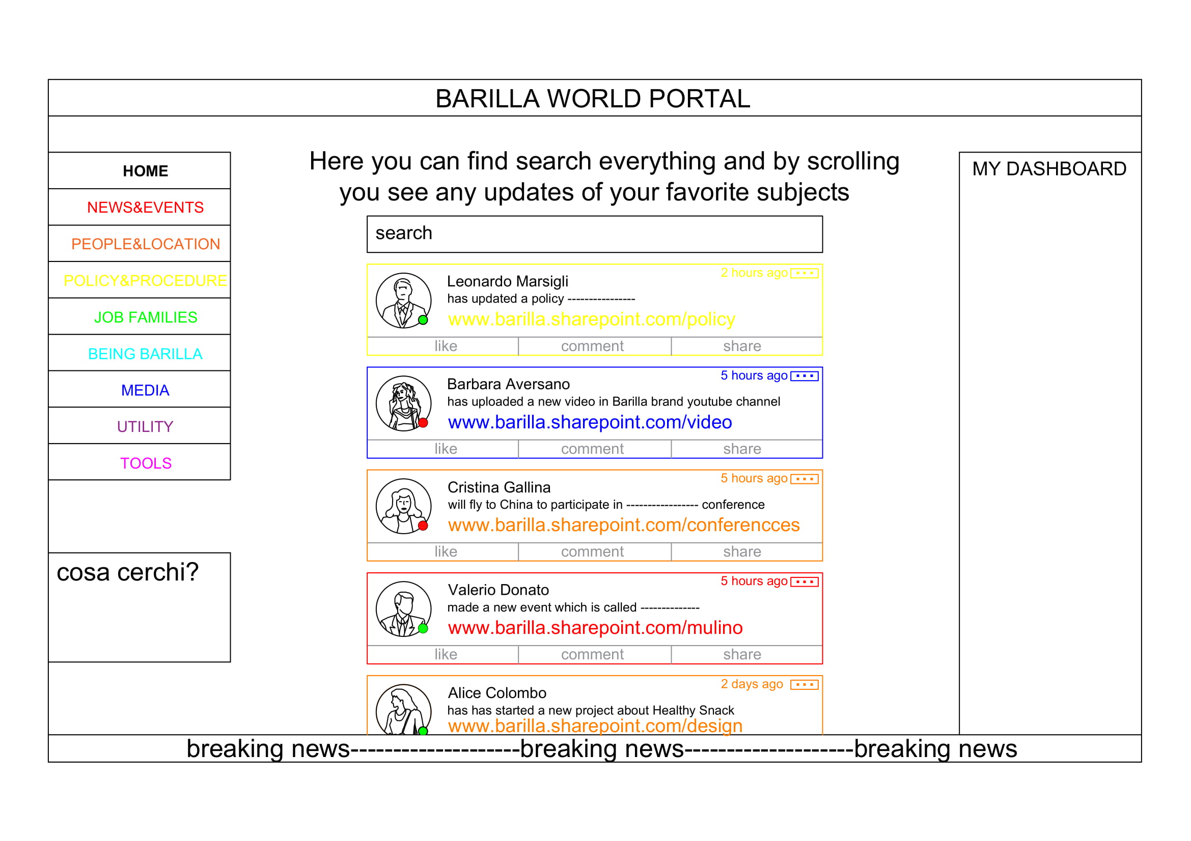
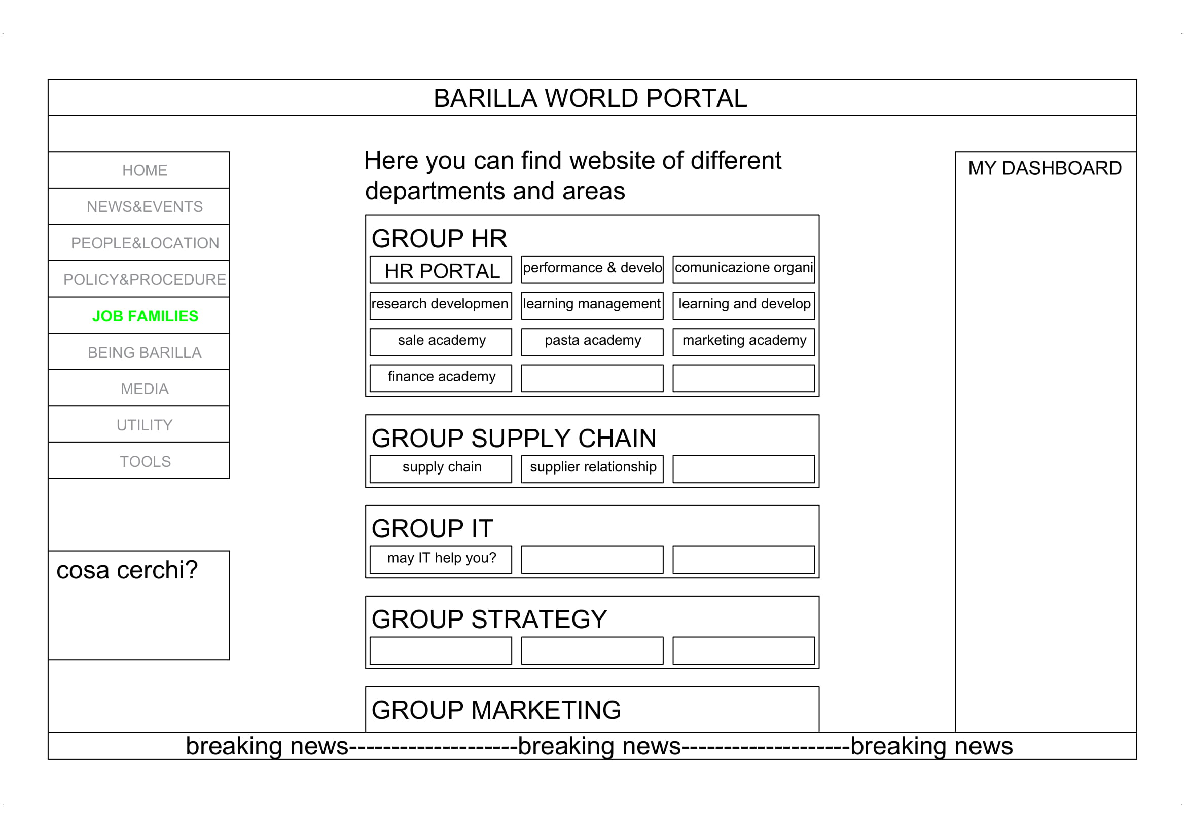
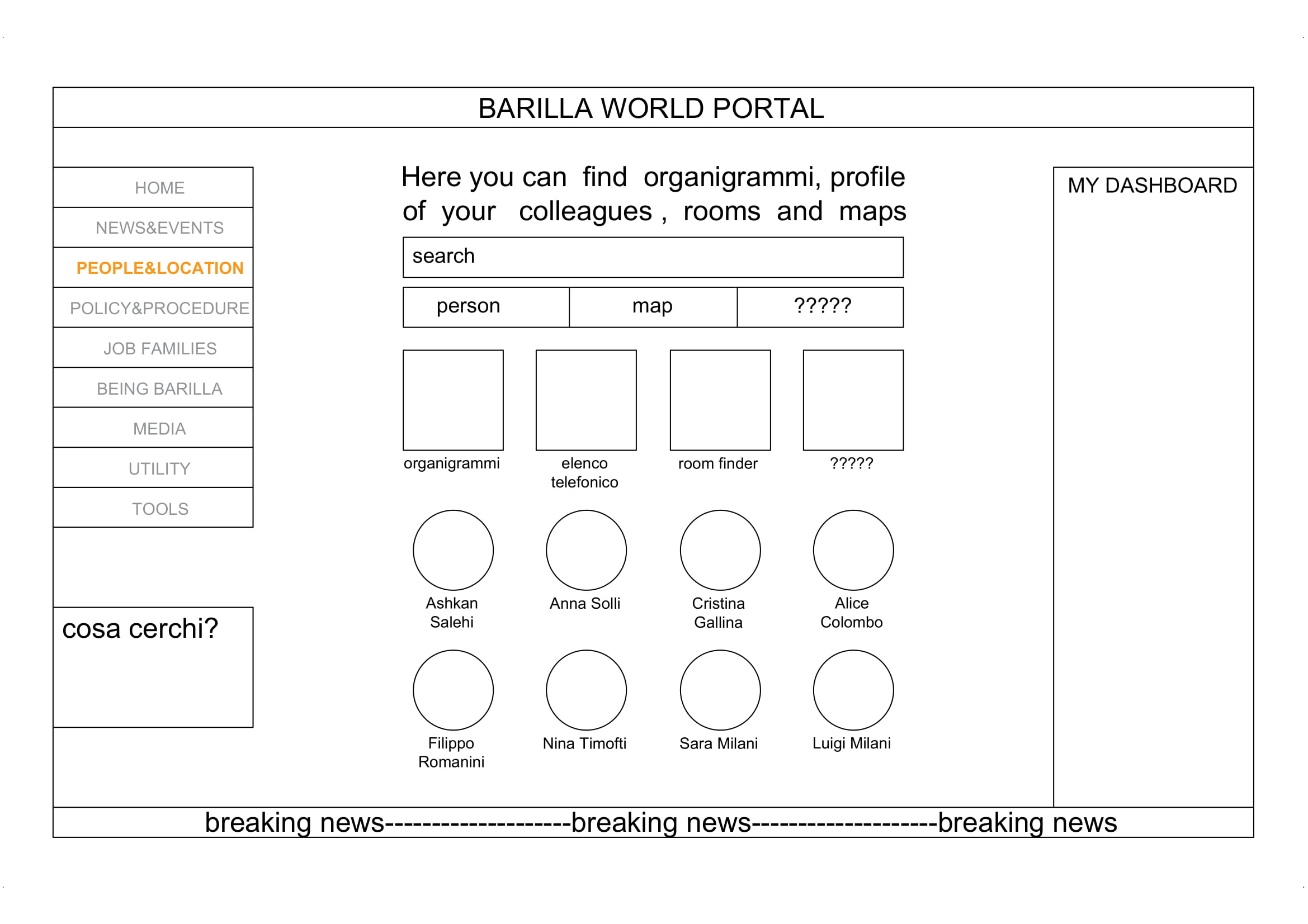
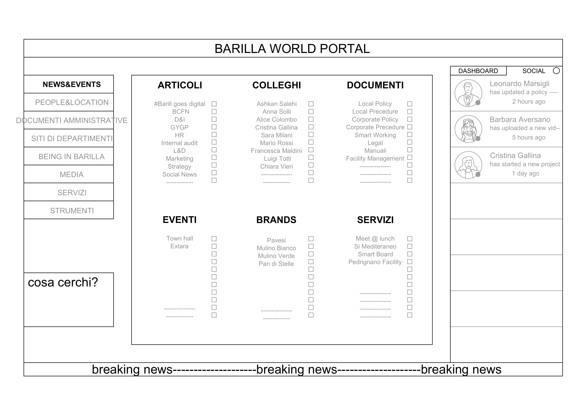
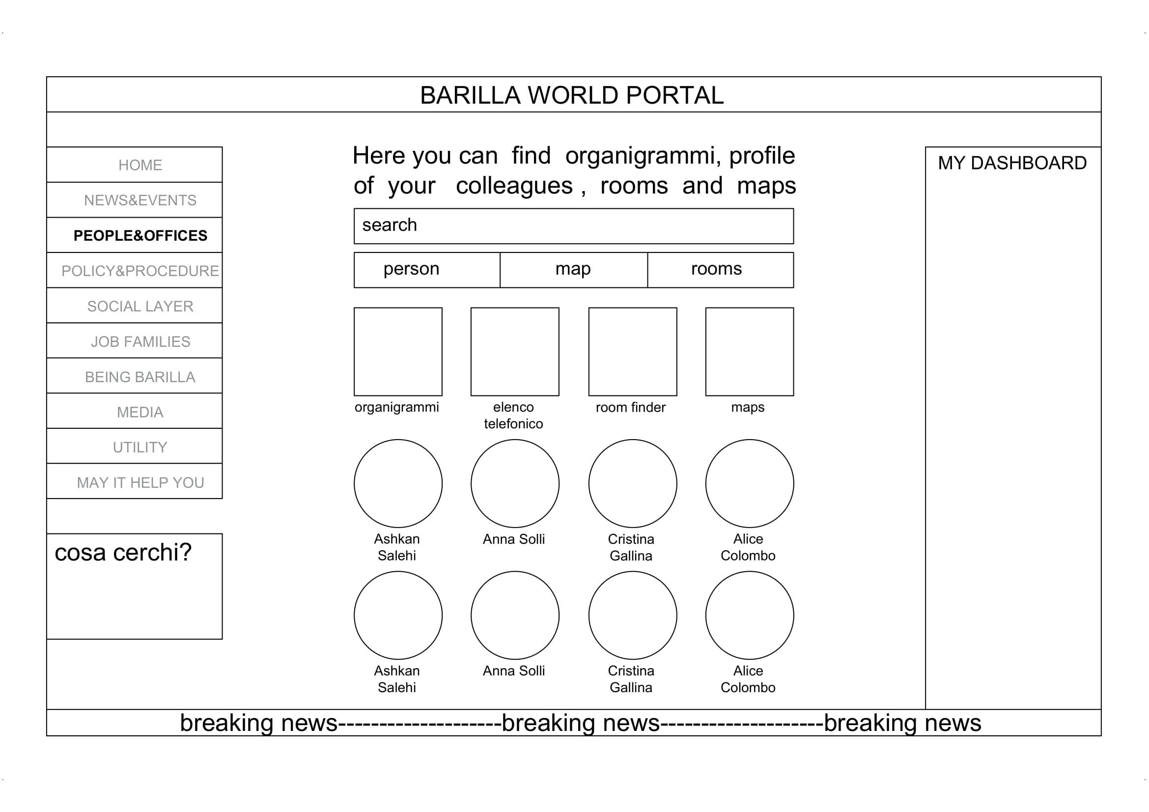
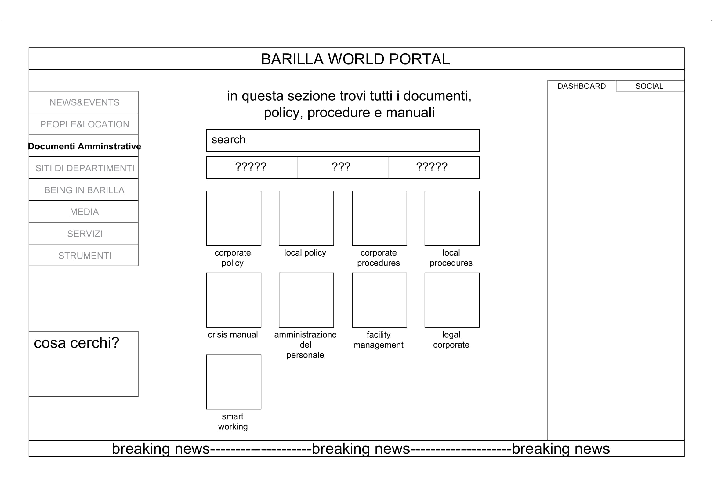
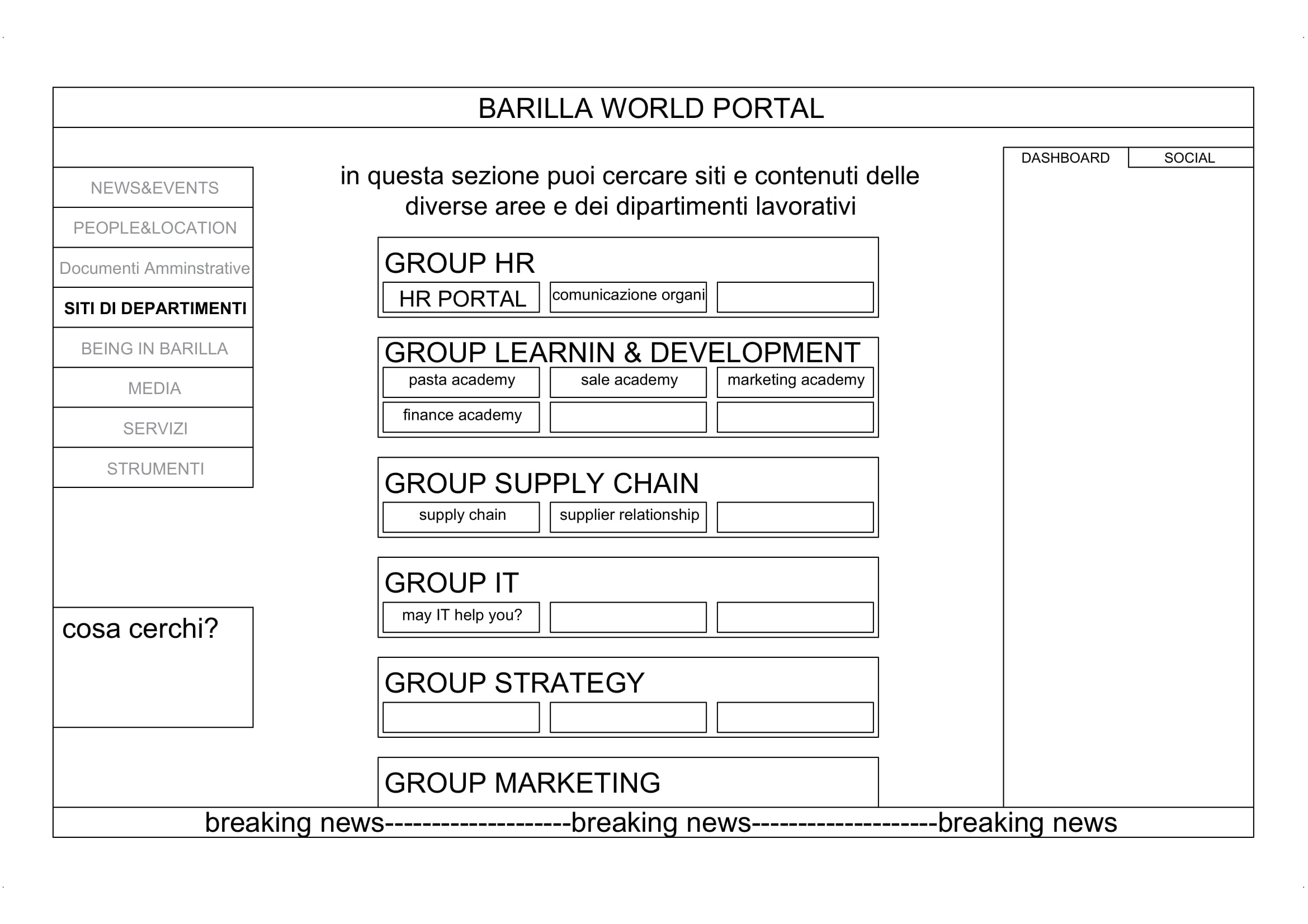
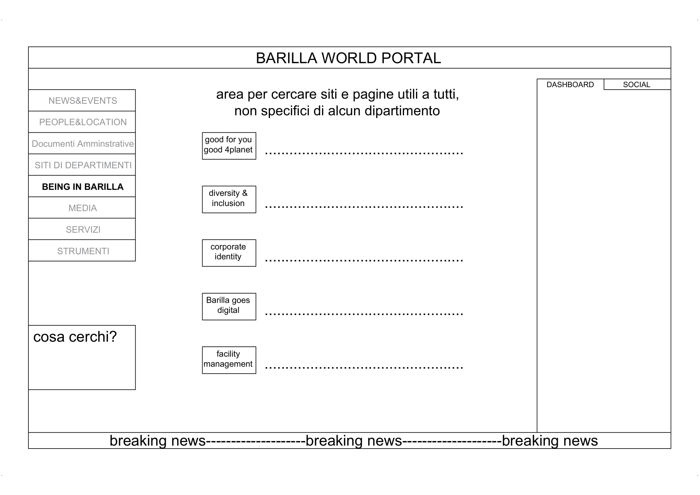
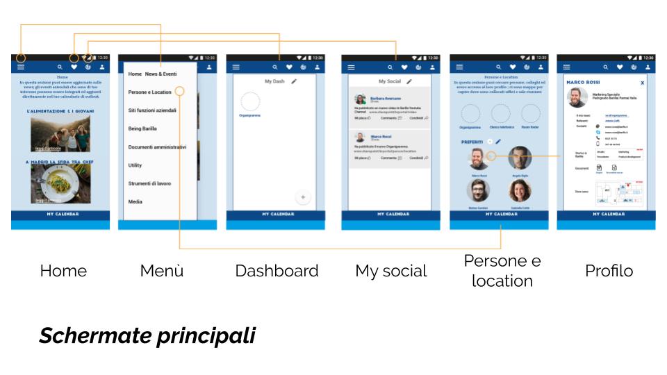
To validate the emerged needs of the interviews and apply the defined design principles, we moved on to the creation of Low-Fidality and Mid-Fidality pretotypes.
Why did we use prototypes?
We defined 4 different personas for our project according to their age of employyes, their experience working at Barilla, the department they are working in, the possible needs and requirements they may have, the problems they may face, and how frequently they have to travel.
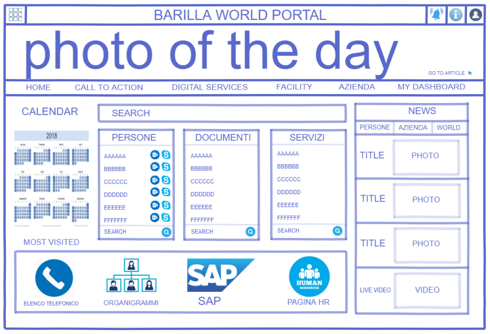
After having tested our ideas and solution and getting feedback from employees, we started to include graphics and functionality in our prototypes, therefore we designed High-Fidality prototypes.
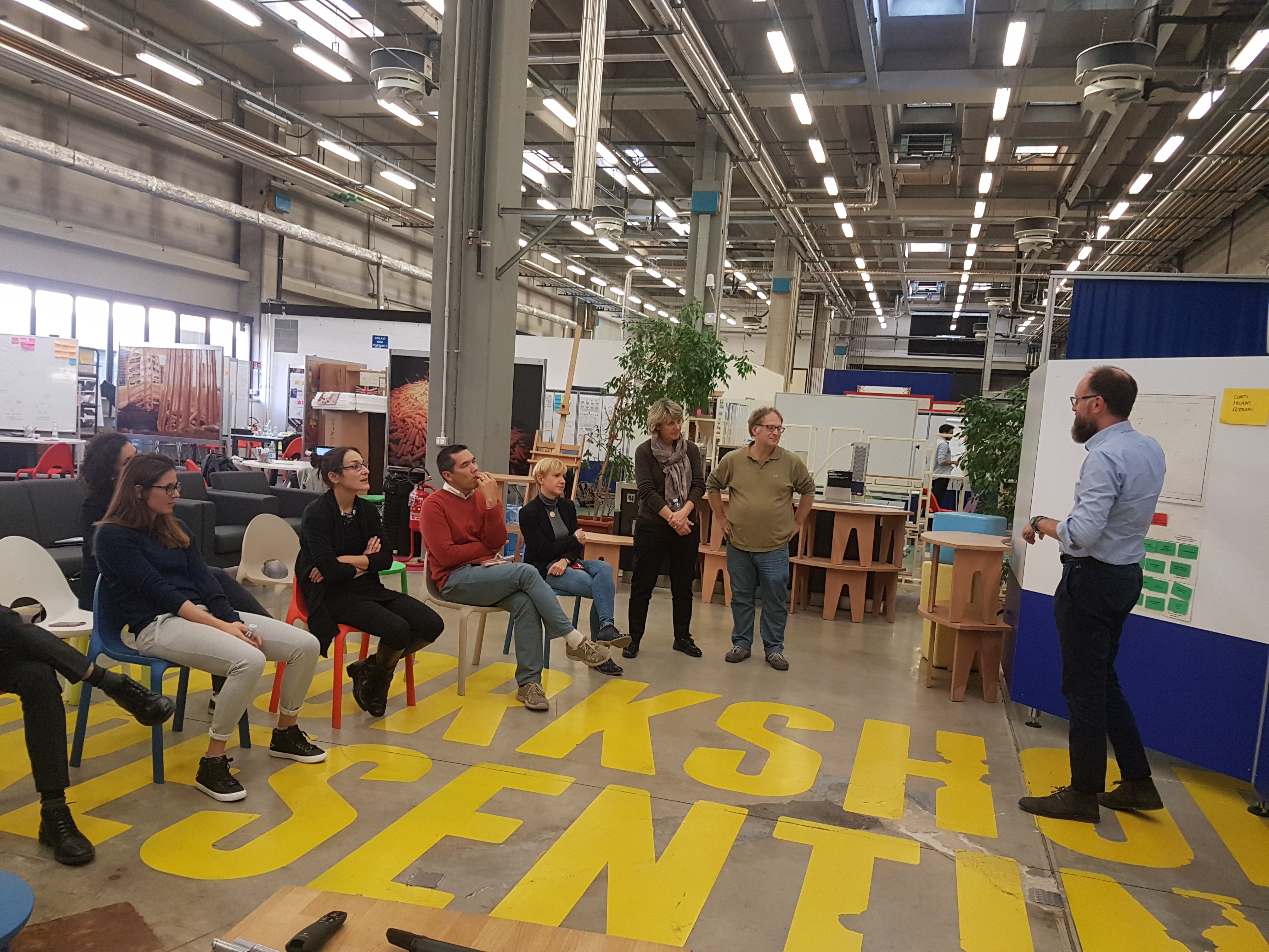
To ensure about functionality and quality of our ideas we invited the employees(40% already knew about our project, and the rest saw our project for the first time) to test our prototype and let us know about their opinion.
Our project received 95% user satisfaction scores with a 25% higher UX score than average. We presented our final project at Barilla Company headquarter in front of +50 colleagues. The proposal got accepted by IT-department and will be implemented by Open-Knowledge Company.
© 2020 copyright all right reserved